All of us here at Compass Commercial are excited to introduce to you our new look! We loved our past look, but we felt it was time to bring our brand into the 21st century. Rest assured, we have no intention of changing the way we do business. Instead, we hope to continue to improve and grow as Central Oregon does the same.
It has always been our intention to put the needs of our clients first. From Compass Commercial’s start in 1996, our founders sought to create a new kind of commercial real estate company. Instead of picking a company name that incorporated their own names, as is common for most real estate agencies, the founders decided to pick a name that could be passed down for future generations. Thus, Compass Commercial was born.
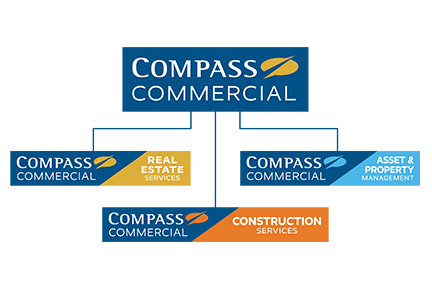
Compass Commercial has grown since its start nearly 25 years ago. In 2000, Compass Commercial began a property management department beginning with just over 300,000 SF. The name of the department was later changed to Compass Commercial Asset & Property Management which currently manages over 2 million SF of commercial property. Compass Commercial grew again in 2009 with the addition of a Development Services division. The name was later changed to Construction Services in 2015. The 2006 version of our Compass Commercial Real Estate Services logo was then adapted to accommodate these additional segments of the company.
The concept of a compass is symbolic to the company’s goals. A compass is a guide, and each broker, property manager, construction personnel and staff member are there to guide, advise and serve their clients to help them meet their unique real estate objectives. That is why a compass is in our logo and has remained there through two logo updates.
![]()
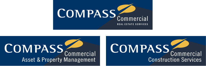
You can see the new logo did not fall far from the prior version. However, we wanted to improve upon readability and clarity between divisions.
The three divisions needed their own distinct branding. This was accomplished using color. Blue is a meaningful color for Compass Commercial as it expresses trust and reliability. Gold for Real Estate Services (Brokerage), light blue for Asset & Property Management, and Orange for Construction Services. The color helps to quickly identify which division is being represented.
![]()
You will soon begin to see this new look throughout our emails, advertisements and signs around town. In addition, on January 1, 2021, we will be launching a new and improved website as well as Yardi Voyager. The new website will allow you to easily navigate all available properties and connect with a commercial real estate expert. Our Asset & Property Management department is implementing Yardi Voyager to better serve our tenants, owners and vendors. This state-of-the-art platform allows users to easily create maintenance requests, pay rent, get an up-to-date snapshot of their assets and much more.
Compass Commercial is excited to move into the future with our updated branding and new technologies, so we can better serve our clients and the community.